BEAMBEAM_NYC
Description:
The game is like a cute and fun experience where you are traveling through New York City with a bubblegum/ pop style. It is a platformer video game where you act like a bunny girl traveling through Manhattan. You’ll visit downtown first, then midtown, and at the end upper manhattan. Discover fun places as you walk through them.
Design Process:
Idea Generation:
The whole story aimed to be based on our real experience: studying and living in NYC. Because everything here is new to us and we want to make our game a good way to store this memory. Besides, we thought this is a good idea for an adventure game. And we were inspired by “The Powerpuff Girls” for our character design, we love the high contrast color and in a magic bubble way. Actually, we wanted to add some beggars, tramps, or even bad guys which may be the enemies or the obstacles. But we want this game more fancy and cute, so we decided to remove that and add more items that can make people happy, like the milk tea, the good taste Chinese restaurants, and so on. And that is the reason why we choose to use bright colors for each stage.
What went right :
1. Art/Style:
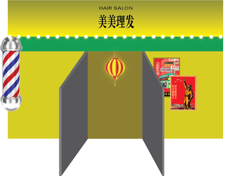
The development process consisted of studying the aesthetic we wanted to use and starting making the assets we needed for the game. We hope you like our special scenes with strong high contrast and colors.



Also, the animation of our character:
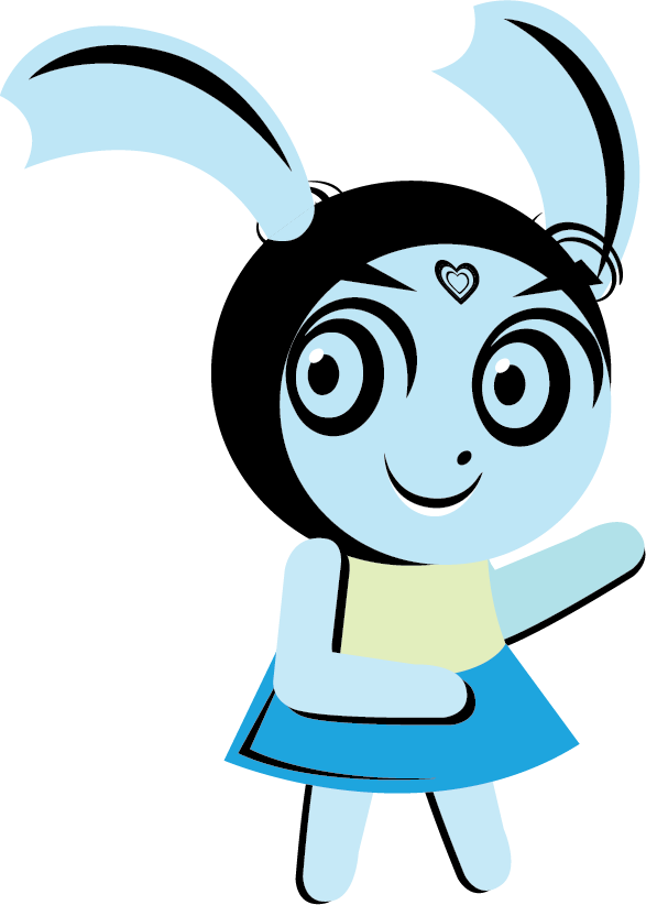
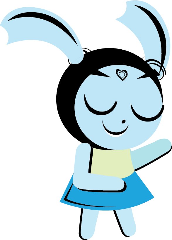
With the eyes open and close, we made that;
2. Stages: we decided on the idea of walking through NYC and we made it:

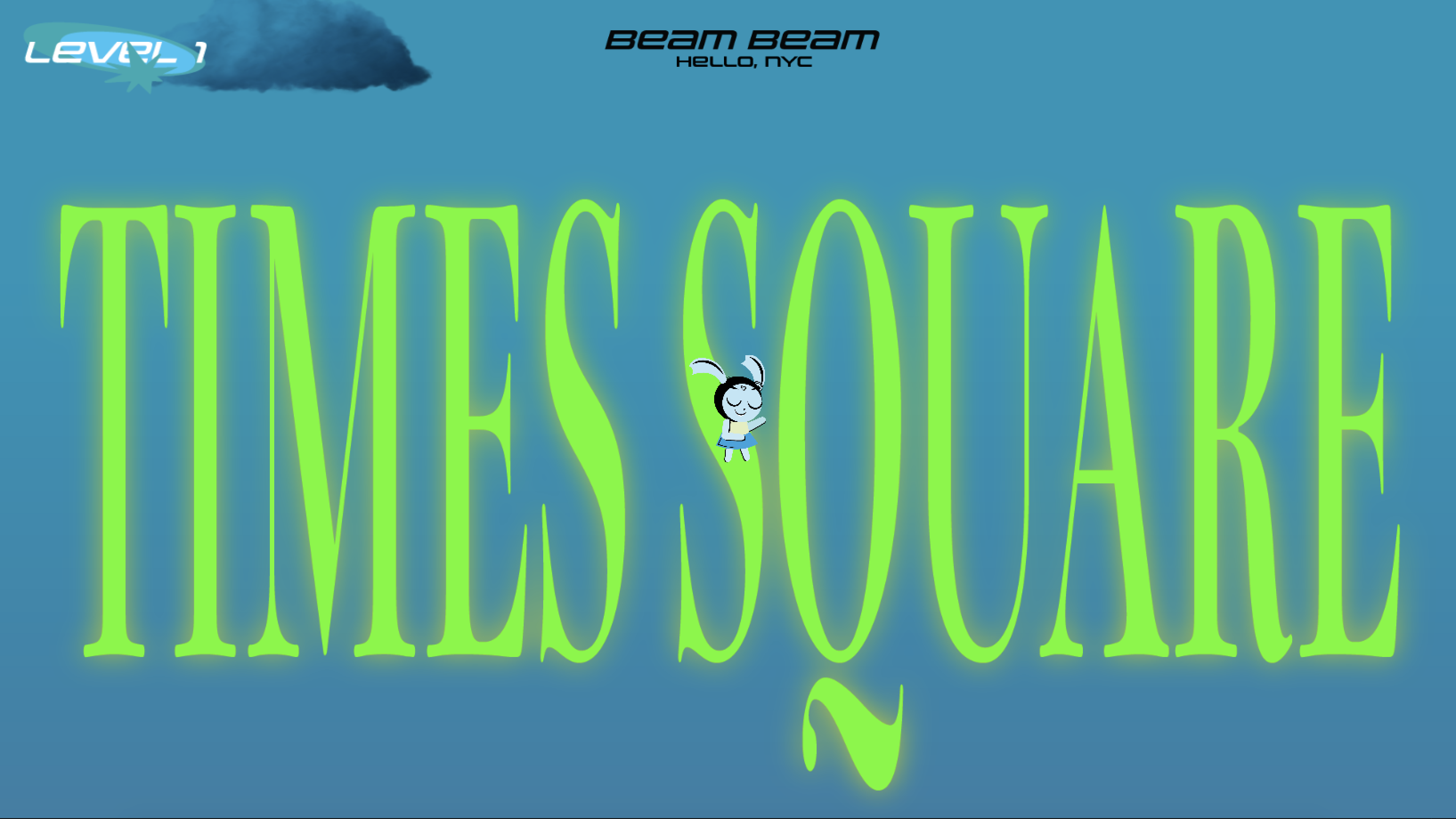

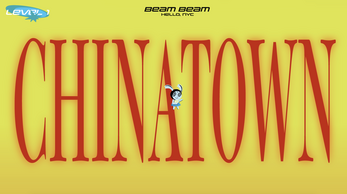
We have chosen three landmarks of each town with their marked icons to make each game level vivid.
3. A whole story/game:
We made the whole loop of this game:
Start:

Different levels as we talked before;
Win:
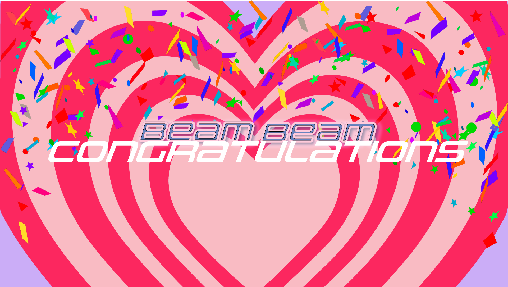
Lost:
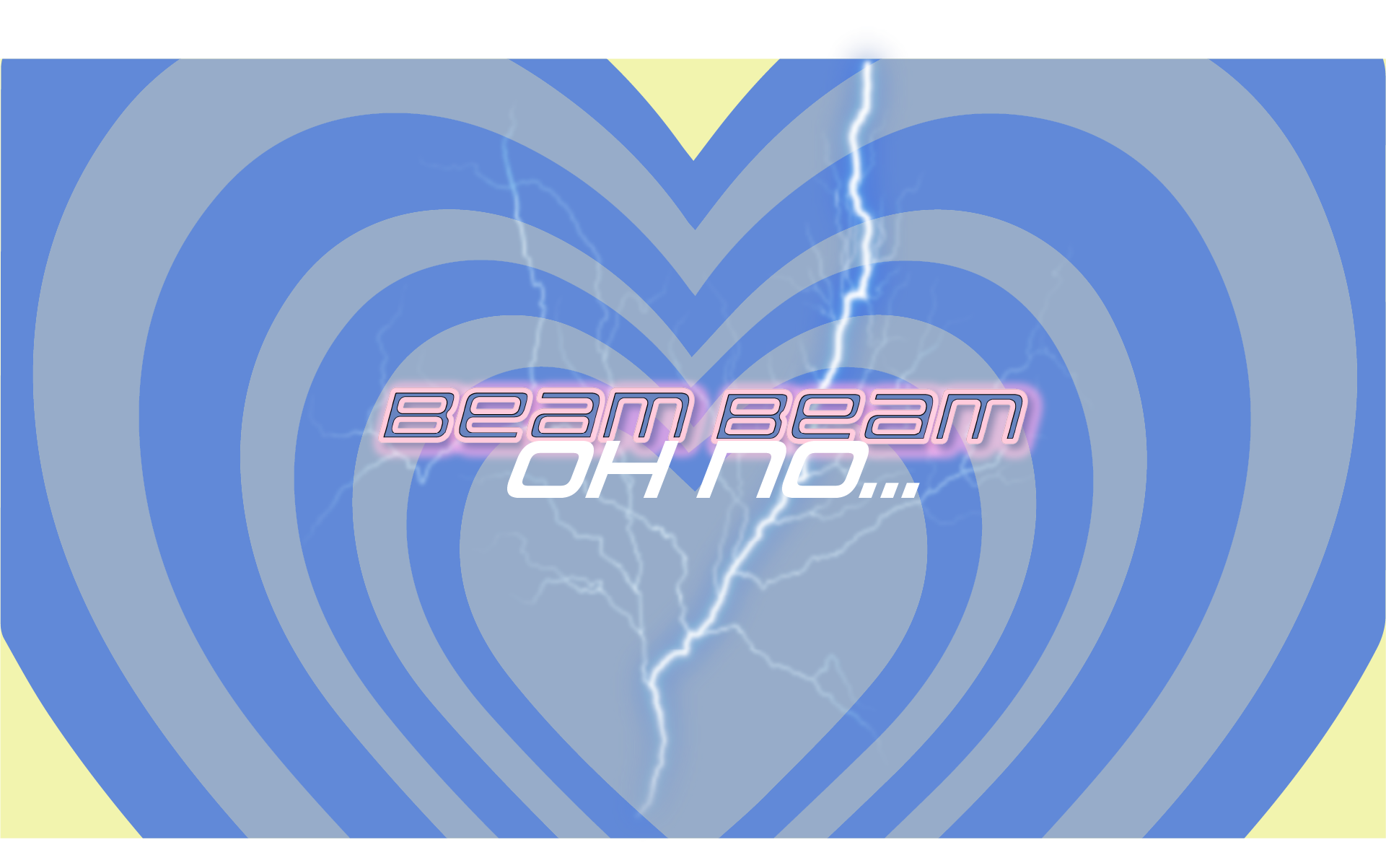
And we make them all stay in the same art style, which can bring users an immersive experience of our game.
And we even add some “clouds” to make our game more vivid:
What went wrong
1. Lack of various sound effects; We should add more sound as well as being attacked by some enemies, or collect the tea, or some items player can collect.
2. Lack some player actions besides jumping as well as multiple animated states; We should add some shifts like when users make the player turn around rather than just making its eyes shine.
3. Some enemies attacking. Even though we want this to be a cute one, we should add something that may make this game more challenging like the shit of pigeons or big rats, etc.
4. Lack of some more clear path for player to follow:
Like here: we should add even some dark yellow blocks as the bottom line that informs the player they may fall if they drop off them.
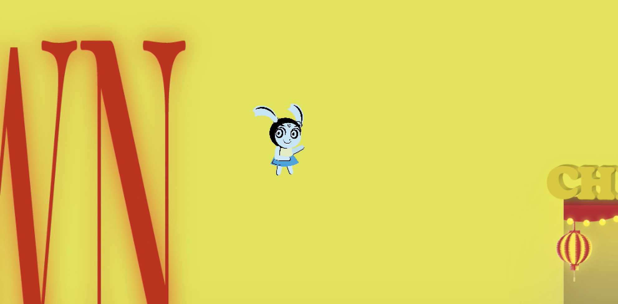
5. There is a problem with the game level that it doesn't change even we get into the next stage:
What we learned
1. The basic idea of an adventure game; Basic rules of the movement control with the keyboard: WASD and space bar to jump.
2. Basic animation in the unity; "Slice" is good when we want to use a set of pics we made by ourselves, and even just two similar series pics can make a not bad animation.
3. The use of keyboard control and the camera following with the player in the Unity;
4. A further understanding of the colliders and rigid body in the Unity.
Next steps:
1. We should add more actions/animations of the player, like adding different actions when we shift it to left or right; Also with more details like sound or visual effects when the player collected something;
2. We should add some enemies chasing/attacking the player to make the game more fun and irritating;
3. More clear path of the player to make it more understandable for the user to tell where the colliders;
4. Maybe we can change the big titles of each stage into just the landmark items;
| Status | Released |
| Platforms | HTML5 |
| Rating | Rated 5.0 out of 5 stars (1 total ratings) |
| Author | aaronid0305 |
| Genre | Adventure |
| Made with | Unity |
Development log
- DevlogNov 10, 2021
- PostMortemNov 10, 2021

Comments
Log in with itch.io to leave a comment.
This was an insanely cute game with a wonderful outcome. I loved the experience I got and it reminded me so much of Y2K / powerpuff girl games from the 2000s. I also think it was more challenging than I expected which is honestly a fun surprise. Well done.
Really unique style! I really love this main character design which gives me a retro, elegant but cute feeling. But as a platform game, if you fall you would die. This is so strict hahaha
I actually love the color and the art pieces you guys put in a collage. However, I feel like the only 1 life (player falls down and gets back to the first scene) is not a good mechanism for an exploring game, I got frustrated when I am in the third scene and then fall because of the rough collider, which could be another thing to improve -- to make the colliders more fit the illustrations. Also, it seems like the all the illustrations have only one layer to stand, it would be more fun (and more robust if the player falls) if there is something to stand below the roof.
I think the strongest thing about the game is the aesthetics and character design. I love the vibrant and adorable art style, it added a lot to this game. I think the game mechanics could use a little fine tuning, but the foundation is super solid and could manifest in an adorable adventure game if you had the time.
Wish you all feel at ease and find some good adventures in NYC. The unique art style and a good idea of combining the walk slim game and our experience.
I really love that you guys decided to treat "literal" signs as "physical " objects in a virtual setting. This really inspired me to explore the potentials of game engines and their potential to be great narrative devices!
Loved the concept of this game and really enjoyed playing it. I think you could experiment with the game mechanism a little bit. Make the narrative of the game evolve a little bit by introducing newer challenges and incentives as the game progresses. Some experimentation with animations would be good.
The artwork and visual aspect was amazing
Very cool concept, moving through NYC. Sometimes the colliders can be a bit confusing to jump on, not sure where all the platforms are. Consider adding enemies, also give the player a reason to collect the boba tea. It feels like beambeam needs some simple animation as well (walking, jumping, etc). Interesting concept but could be a little bit more fleshed out later.
I enjoy the overall concept you guys have come up with, and the design style is also cool. But I feel like if the game could add more game mechanism and different challenge in each level would be more complete. The game right now is a little unclear to me.
I love the game idea that the player goes to famous places in NYC. The visual is very appealing. I think that you can add some storyline, history of the famous places or some old memory. People can get more engage in the game. You can also add climbing interaction in the game.
Great idea and I really enjoyed the visual elements in the game from the title card to the end of the game. I also liked that each level was a different color to create a feeling a variance between the levels. The character design and aesthetic is super appealing. I think it would be helpful to create a ground or something to land on to make navigating the level a little easier. Also, like we said in class, it would be also helpful to the story line to have some sort of counter or maybe different items to gain in each level to make everything a little more clear.
Your game is adorable! I love the graphics. I agreed with people in class about adding colliders to make sure the player doesn't fall down the side. You could also enable a double jump so they can get back onto a height.
It is a cute idea bringing the famous places in NYC to the game. I like how you incorporate typography as part of game elements embarking the tour/journey of the city. For a cohesive visual experience, as you implemented the typography, I would stick to typography elements for the game's visual design in environment or interaction. For example, combining with the idea I suggested in class, you could trigger English popping up translating Chines beautifully aligned with the building designs while the player jumping around. Applying Graphic design's layer grid system in news papers to your game design would not only curate more aesthetically attractive game appearance also probably provide a space to be more creative with interesting player's behaviors and movements such as climbing or moving around between news paper grid spaces according to a storytelling. or, since you are taking a sort of magazine heading look, magazine style game design. so many possibilities with your fashion and design savvy.